
HCA Healthcare
BACKGROUND:
This project is a part of HCA Healthcare’s physician web portal, which allows physicians to provide more information about their background to potential patients. This can include specialties, the physician’s professional history, and what facilities they operate under.
My main responsibility was updating the look and feel of the screens, to make the web portal feel like a modern part of the HCA brand. I decided to perform some usability/accessibility testing in addition to this so that I could gain a better understanding of how these tools work within the UX/UI space.
GOALS:
The goal of this project was to take the old opt-in screens and update them to the new design system used by HCA Healthcare, Neutron. There were some problems that were made known regarding the old design system, and ways the workflow could be improved by incorporating the new one.
MATERIALS:
This project was completed using Sketch, Invision, and the HCA design system for web. This project was the first in which I was designing under the system used by an entire company, so one obstacle was designing within those restraints.
Invision allows for teams of designers to suggest quick changes or tasks that have priority on current design sprints.
RESEARCH:
Accessibility testing:
- The Sketch plugin Stark simulates accessibility tests such as different forms of colorblindness and checks the contrast between layers.
- Color and contrast testing


Usability testing:
- Labels with buttons: Icons don’t translate to the user 100% of the time. Adding labels underneath every icon helps prevent confusion.
- Font sizes: Font size not only establishes visual hierarchy, but also needs to be easily readable on every type of device.
- Contrast: If the font color is too similar to the background, it can be difficult to read for the hard of sight and those with certain types of colorblindness.

OUTCOME:
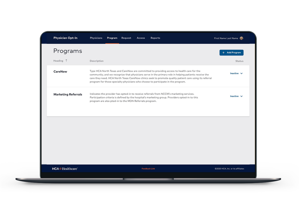
Example 1-
No clear visual hierarchy – Blue buttons and branding are placed throughout the screen, so the user’s eyes get confused at what action they’re supposed to take. The first action could very well be ‘Connect office’, ‘Search’, or ‘Edit number of entries’.

The updated screen allows for color hierarchy and contrast between user decisions. ‘Edit’, ‘Remove’, and ‘Save’, all distinguish themselves enough so that they are separate actions.
- Edit is placed near the other buttons, away from the description to allow breathing room.
- Remove is emphasized in capital letters which implies they will not be able to undo this action.
Save is placed in the lower right hand corner of the screen apart from the other elements, which implies it is the final step.

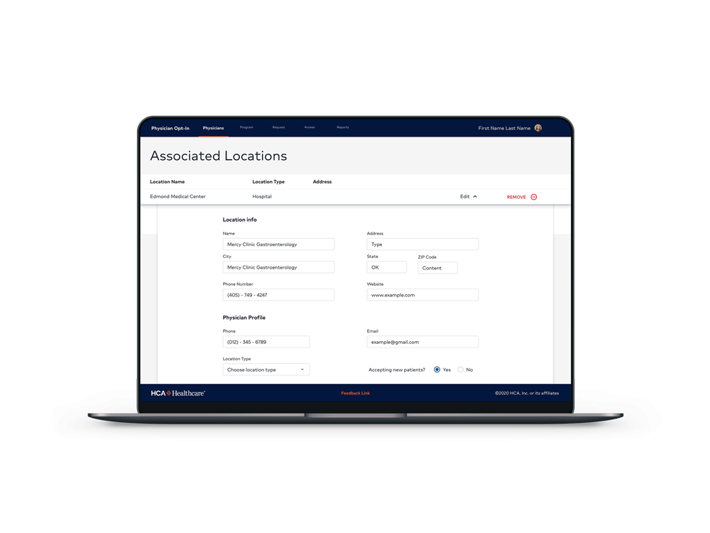
Example 2-
Form layout – The original layout lacked the ability to be easily scannable, because the fonts are too similar in color and weight. There is no clear split between sections of the form, and this leaves the user feeling like every part is connected to one another.
The updated screen shows a sense of each part of the form being separate from each other, and keeps the user from scanning through an endless form. By adding visual weight to headings and separation with more white space, the user is allowed to scan each part of the form individually.
Final Mockups
 jottenbacher.com